
What does a UX designer actually produce? Here, we will explore the concept of UX Deliverables, a term that describes the outputs of a UX design process during its various stages. The deliverables produced by UX designers vary according to their role in the design team and also depending on the methods and tools used by each role. We will provide an overview here of some of the most common types of deliverables.
A UX design process typically follows something similar to a design thinking approach, which consists of five basic phases:
- Empathize with the users (learning about the audience)
- Define the problem (identifying the users’ needs)
- Ideate (generating ideas for design)
- Prototype (turning ideas into concrete examples)
- Test (evaluating the design)
The first two phases (empathizing and defining the problem) are often grouped into the term “User Research” – i.e., understanding both the nature of the users and how this affects their needs. A number of tools and methods can be used in each phase. Each tool or method might produce a different type of output (UX deliverable), but here we will focus on some of the most commonly used types to give you an overview of what you might be expected to produce in a UX design career.
User Research Deliverables
Personas
A persona is a fictional character which the designers build as a sort of user stereotype. It represents the typical users, their goals, motivations, frustrations and skills. Other information such as demographics and education backgrounds complete the persona. Depending on the scope of the projects, designers will generate a number of different personas to capture as wide a part of the audience as possible. Generating personas helps designers empathize with the users and demonstrate a thorough understanding of who they are and what they want to achieve.
Storyboards
A storyboard is an idea borrowed from the movie industry. It essentially consists of a comic strip, outlining the user’s actions and circumstances under which these are performed. The power of this idea is that it doesn’t only demonstrate what the user does, but it also reveals the environment, which might be affecting how or why the user does something.
Customer Journey Map
A customer journey map (also known as an experience map) is a diagram that represents the steps (i.e., the process) taken by a user to meet a specific goal. By laying the process out along a timeline, the designers can understand the changes in context as well as the motivations, problems and needs along the way. By identifying the major stumbling blocks for users, the designers can better relate to their problems and begin to see where a product or service might fit along the way to help the user.
Ideation Deliverables
Brainstorming
Brainstorming is a process whereby a team of designers generate ideas about how to address the issues and opportunities identified in the user research phase. The concept here hinges on the generation of as many ideas as possible (even if they are completely wild) so that the designers can later sift through these and reduce them to the ideas that seem most promising. A central point is that the team members are free to explore all angles and realms; indeed, the best solutions can sometimes sprout from the craziest-sounding notions.
User Flow
A user flow diagram is a simple chart outlining the steps that a user has to take with your product or service in order to meet a goal. In contrast to the customer journey map, the user flow diagram considers only what happens with your product (that is to say, ignoring all external factors). These diagrams can help designers quickly evaluate the efficiency of the process needed to achieve a user goal and can help pinpoint the “how” (i.e., execution) of the great ideas identified through brainstorming.
Prototyping Deliverables
Sitemaps
Sitemaps show the hierarchy and navigation structure of a website. Such maps are also often produced for mobile apps, as well. They serve to show how the content will be organized into “screens” or sections, and how the user may transition from one section of your service to another.
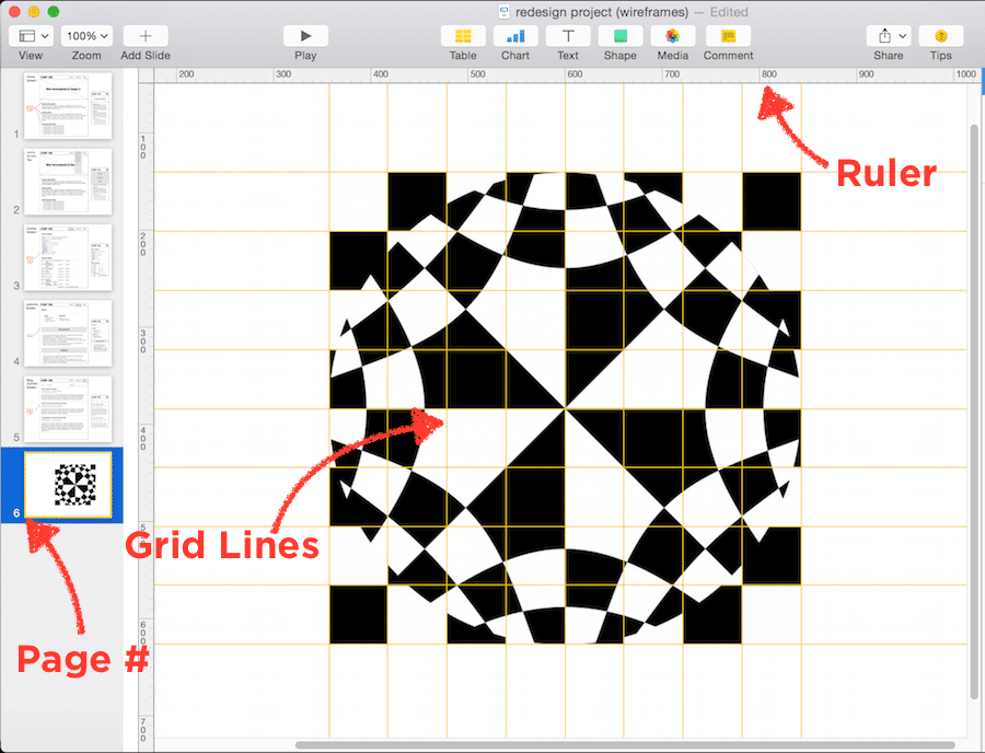
Low-fidelity prototypes
Once you have your sitemaps ready, you can begin to sketch how the content will be laid out on each screen. A low-fidelity prototype omits any visual design details and serves as a rough guide to allow designers to get a feel of how and where they should place content. Low-fidelity prototypes can start as hand-drawn sketches (which are great, because they are fast and cheap to produce, so you can easily throw them away if you change your mind) and later refined as computer-drawn wireframes, which are more faithful to the presentation of information on a real screen, but still lacking visual design details.
High-fidelity prototypes
These prototypes are a step up from low-fidelity prototypes. Often they are called pixel-perfect prototypes because they try to show all the visual and typographic design details of a product, as it would be shown on a real screen. They take into consideration physical screen dimensions and are produced in a size that corresponds to the physical device’s size. Although these require a lot more time to produce compared with low-fidelity prototypes, they are often the type of illustration that you would want to show to a customer or stakeholder.
Interactive prototypes
The low- and high-fidelity prototypes discussed above are little more than a collection of static images. To better evaluate your designs, you might turn these prototypes into an interactive demonstration, aimed at showcasing how the interaction might work with these. Commercial prototyping software allows you to define clickable areas, transitions and events, in order to produce an interactive prototype that captures the user flow process and demonstrates interactivity, without having to write a single line of code. In some cases, you can use a much simpler tool, such as PowerPoint or Keynote. Even better, you can use these interactive prototypes in early user tests, before any code has even been written. This way, you can make sure that your design is likely to work well, before committing to the expensive and laborious process of developing code.
Evaluation Deliverables
Usability report
Once you have a design that is implemented (even if only as an interactive prototype), you can begin to run some evaluations of this design with real users. Evaluation can take many shapes and forms. You can have some users try out your design and then interview them, or work with them in a focus group: This is an example of qualitative evaluation. You could bring users into a lab and ask them to accomplish specific tasks with your prototype, while you measure things such as the number of errors, number of clicks, or time taken to complete the task. In the lab, you can use special equipment, such as eye-tracking cameras, to see where your users’ attention is spent while navigating a particular design. You could also ask them to perform the same task using prototypes that offer alternative design implementations, so you can compare them and see which design is better (known as A/B testing).
There are many ways to evaluate a design. No matter what you end up doing for evaluation, you will have to summarize your findings into a usability report. A complete usability report typically contains the following sections:
- Background summary: what you tested, where and when, the tools and equipment that you used and who was involved in the research
- Methodology: how you went about the evaluation, what tasks you asked the users to perform, what data was collected, what scenarios were used, who the participants were and their demographics
- Test results: an analysis of all the data collected, including illustrations such as bar charts and textual descriptions of the findings, and user comments that might be particularly illustrative or enlightening. Depending on whom you are communicating the report to, this section may contain some more technical details, such as the type of statistical analyses used.
- Findings and Recommendations: what do you recommend, based on the data that you collected and your findings? Write down what worked well, what didn’t and why. State what should be done next to improve the design or move forward with the process.
Remember that a usability report might be directed towards a number of other roles in your project. Managers will probably just need an executive summary and a statement of how the findings impact the overall project timeline. Other designers will be more interested in how you carried out your evaluation and would like all the details. Developers are probably only interested in your findings and recommendations. Ensure that your report is structured and worded appropriately for its audience.
Analytics report
When a designed product has been released and has been running for a while, your company might make some usage analytics data available to you. Looking into this data may offer great insights into how to improve usability, particularly if this data contains users’ transitions and behaviors in your product.
For example, you might find that many users in an e-commerce website are not registering to complete a purchase. Does it mean that the registration process is not easy enough? Does it mean that they don’t see there is such an option? An analytics report contains the insights from this data and highlights areas where the design might be improved. While it is tempting to just put in the nice visuals and charts produced automatically by products such as Google Analytics, the UX designer’s job is not just to lay down the facts but also to interpret them. So, your report must contain the data, but also plausible explanations and recommendations on what to do. It’s also a useful record so that you can see the impact that design changes might have had on your website, after you have identified issues and attempted to address them.
The Take Away
In a 2015 article for the Norman Nielsen group, UX specialist Page Laubheimer analyzed the type of UX deliverable that UX designers most frequently reported as being asked to create as part of their role. Wireframes and prototypes were reported to be most commonly produced, followed by flowcharts, site maps, and usability/analytics reports.
These are what we consider to be “classic” UX deliverables, but one important point to keep in mind is that while these deliverables are produced and shared with others, many other types of deliverables will be produced but never shared (hence ranking lower in this study). In order to produce a wireframe, should a designer not have a complete understanding of the users and their needs? Often, management, clients and other team members are interested only in the type of deliverable that helps them advance their tasks, as well. Given this, the types of the deliverables you produce might need to be “tuned” to whom you are going to share them with, too.
In your role as a UX designer, you will invariably have to produce deliverables for each stage of the design thinking process. Whether you keep these to yourself or share them with others, you need to practice your skills in as wide an array of tools and methodologies as possible, and become familiar with all the types of UX deliverables out there.
Source: www.interaction-design.org
Author: Andreas Komninos


 Author/Copyright holder: Need for Speed Most Wanted 2005. Copyright terms and licence: Fair Use.
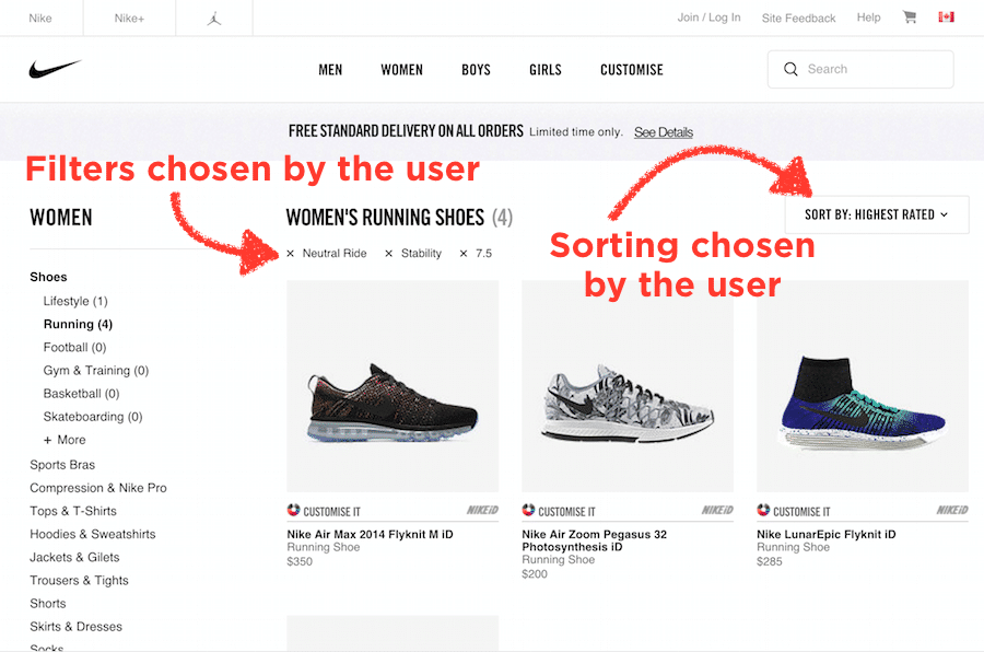 Author/Copyright holder: Nike, Inc. Copyright terms and licence: Fair Use.
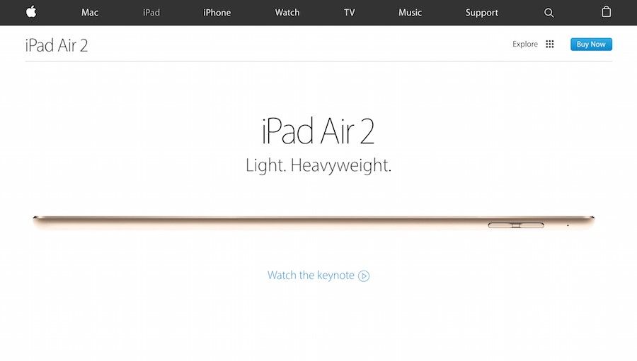 Author/Copyright holder: Apple Inc. Copyright terms and licence: Fair Use.
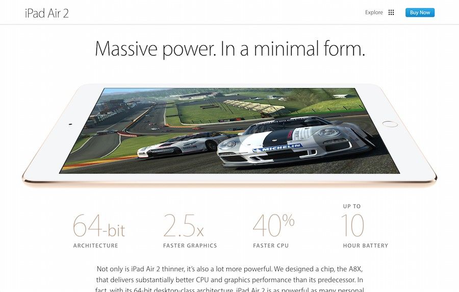 Author/Copyright holder: Apple Inc. Copyright terms and licence: Fair Use.
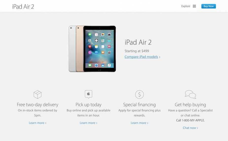 Author/Copyright holder: Apple Inc. Copyright terms and licence: Fair Use.